

by: Matt Wetherington
August 22, 2022
Ideas and Examples to Improve Your Law Firm Website
I was pretty surprised to learn that my article on how we picked a marketing company has been viewed nearly 100,000 times. It makes me very happy to hear feedback from fellow lawyers that used the article to negotiate lower rates, avoid hiring bad companies, and gain confidence to stick with a winning company through the initial growth period. The rising tide truly raises all boats!
The purpose of this article is to share the guidelines I created to build the Wetherington Firm homepage. I am not a design expert and my personal preferences may not align with everyone’s taste. But I have personally reviewed thousands of high-ranking lawyer websites and compiled what I personally find to be effective. Even if you do not agree with how we executed on those concepts on this website, you may still find some useful ideas to incorporate into your own. If you like this article, join the Business of Law Facebook Group where similar content is created and shared.
At the risk of stating the obvious, having a beautiful website is not enough to rank on Google. If you do not have a comprehensive SEO strategy, no one will see your beautiful website. And you can have the best design ever, but without top-notch photos, your website will still look terrible.
When I handed over my ideas, I included a note worth repeating here:
Important: Consider these the murmurings of an idiot. Do what you think will convert clients, not what looks nice.
Technical Details I Care About
- 99+ Pagespeed on mobile
- 99+ Pagespeed on desktop
- WordPress only
- Schema used throughout
- ADA best practices on every page
- Big sans serif fonts from google’s library
Home Page Ideas
Here are the homepage elements I liked and the general order I wanted them used:
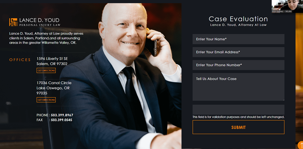
- Big menu above the hero image that sharply contrasts with the hero image.
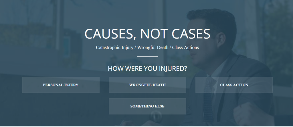
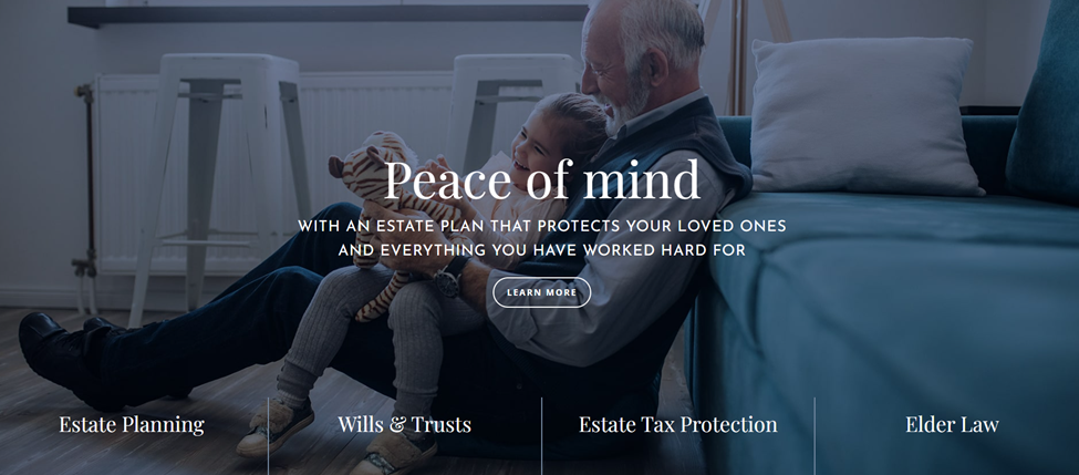
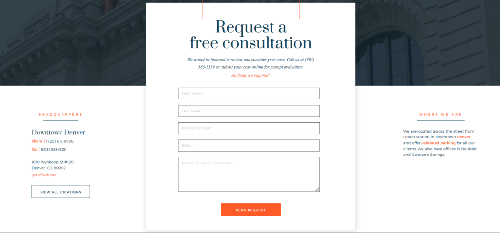
- Static hero image has contact form or interactive form on the right half.
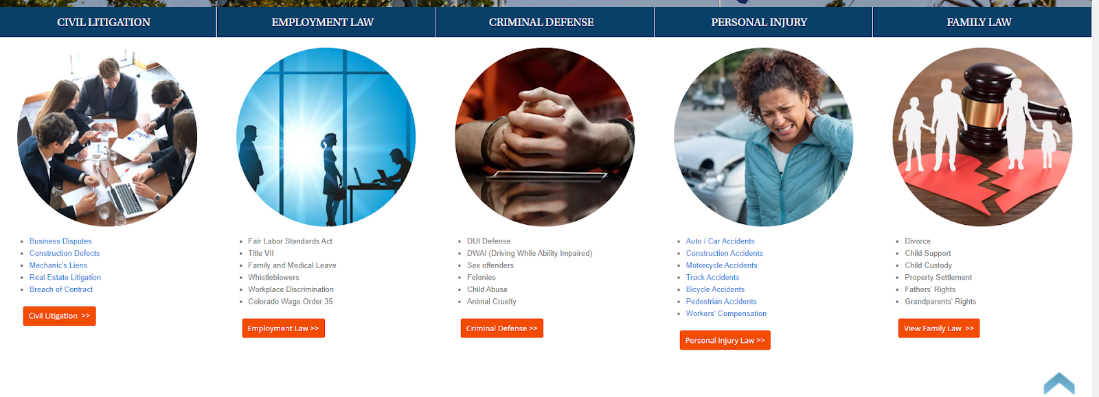
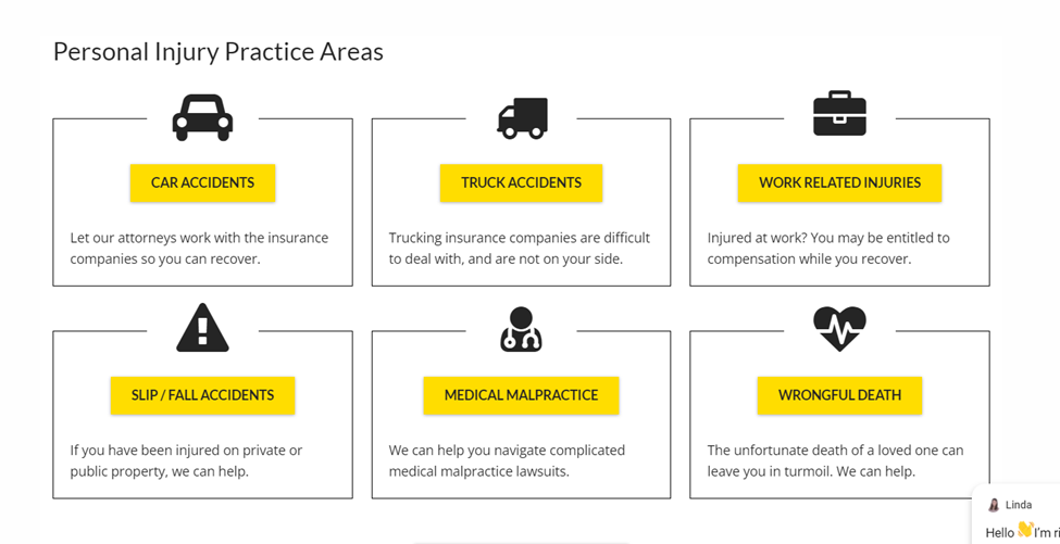
- Main practice areas listed directly below the hero image with an inventory of practice areas
- Verdicts
- Benefits of hiring us
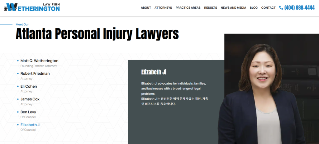
- Listing of attorneys on an accordion
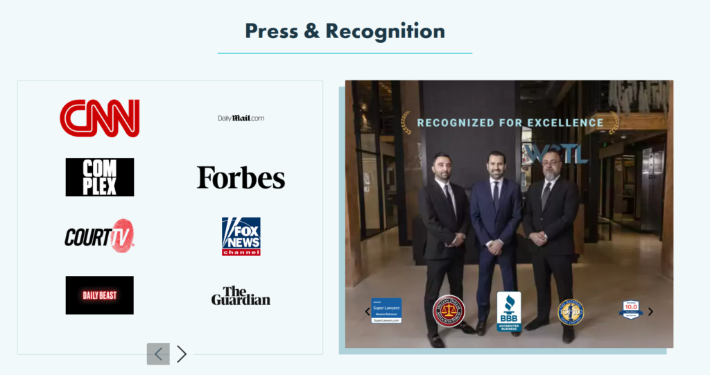
- Trust Badges
- Testimonial and/or Reviews
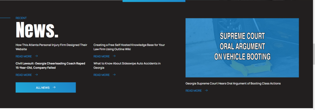
- Recent blog posts
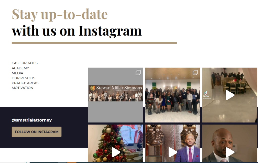
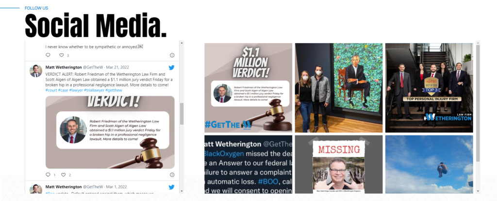
- Recent twitter and/or instagram posts
- Whatever long form content we need for SEO purposes
- Footer
Here are some pages that do a lot of things very well on the homepage. The design company responsible is listed in parenthesis when possible.
- Naqvi Law (Nifty)
- Elksun and Sisson (unknown)
- The Gomez Firm (unknown)
- Malek Law (PaperStreet)
- Tsiger Law (RizeUp)
- Fielding Law (ILawyer design dramatically improved by Clixsy)
- West Coast Trial Lawyers (formerly Paperstreet)
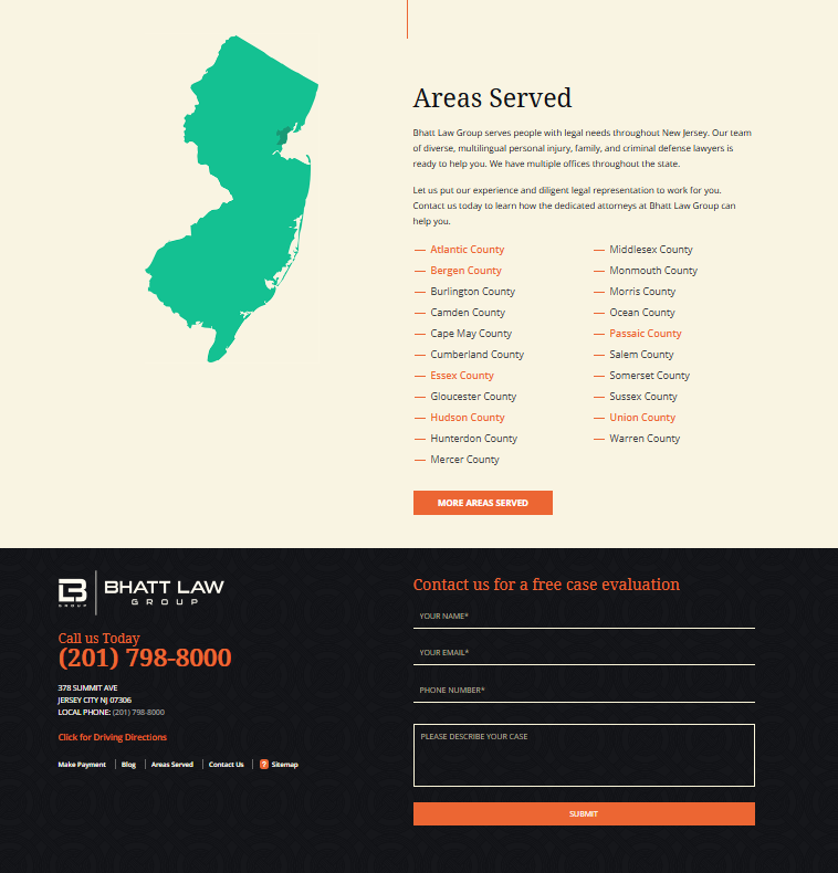
- Bhatt Law Group
- McClellan Law (Scorpion)
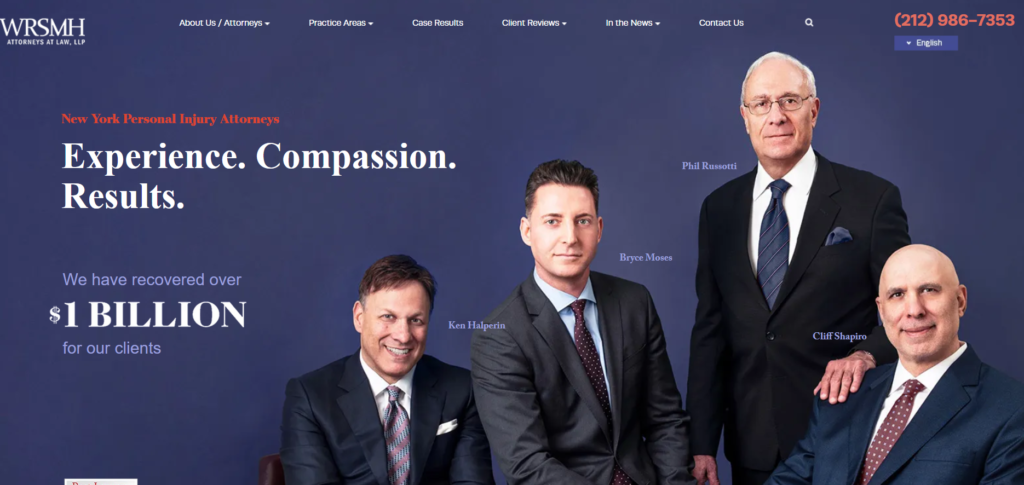
- Wingate, Russotti, Shapiro, Moses & Halperin (SLS Consulting)
Examples:
Big menu above the hero image that sharply contrasts with the hero image.


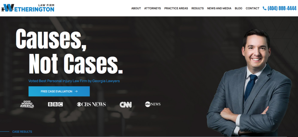
Static hero image with contact form or interactive element.


Examples of Nice Law Firm Website Menus

Main practice areas listed directly below the hero image with an inventory of practice areas
Verdicts Listing

Benefits of hiring us
Lots of fun examples here that look great:


Listing of attorneys on an accordion

Trust Badges
Whatever. I don’t care. But research says it needs to be there.

Recent blog posts


Recent twitter and/or instagram posts
Instagram on homepage:
Nice Footers
Conclusion
That’s it. Now I am going to turn this over to ChatGPT, who says: It is important to have a comprehensive SEO strategy to ensure that your website is visible to potential clients. Additionally, implementing technical details such as high page speed, use of WordPress, schema, and ADA best practices can improve the user experience. By including elements such as a large menu, a static hero image with a contact or interactive form, practice area listings, verdicts, benefits of hiring the firm, attorney listings, trust badges, testimonials, and recent blog and social media posts, you can create a website that is both visually appealing and informative. The examples provided in this article demonstrate how these elements can be effectively incorporated into a law firm website. Remember, design should be done in a way that will convert clients, not just what looks nice.
If you like this article, join the Business of Law Facebook Group where similar content is created and shared.
If you REALLY like this content, refer all of your admitted liability catastrophic injury trucking wreck cases with blown policy limit demands to me.
See How Wetherington Law Compares
Choosing the right personal injury lawyer in Atlanta matters. See how Wetherington Law Firm stacks up against other firms: